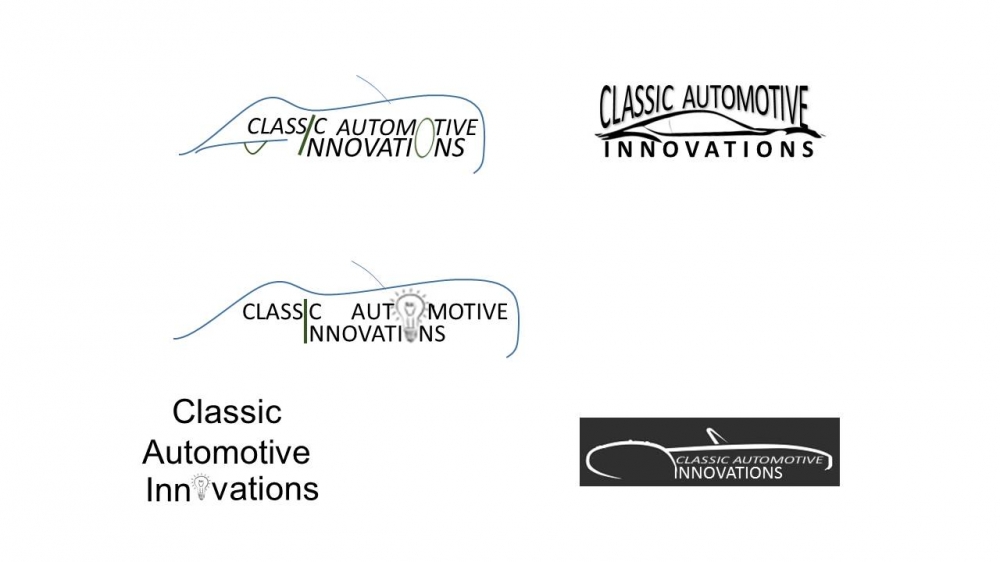
Our company supports both products and services for the Classic Automobile industry (think of old Austin Healey's, MG's, Alfa Romeo's, etc.) with an emphasis on innovative products. For example, we have a patent for a product that powers an original classic speedometer with modern day GPS technology. Many people that collect classic cars are purists and want to keep it as original as possible. Therefore our logo should represent both classic AND innovative at the same time.
Our company supports both products and services for the Classic Automobile industry (think of old Austin Healey's, MG's, Alfa Romeo's, etc.) with an emphasis on innovative products. For example, we have a patent for a product that powers an original classic speedometer with modern day GPS technology. Many people that collect classic cars are purists and want to keep it as original as possible. Therefore our logo should represent both classic AND innovative at the same time.
Instructions:
Something simple that really pops -- keeping in mind that the logo will be used in print advertising, on the web, on swag, etc. The focus should be on the 'Innovations" part of the company, but not to the point that it stands alone too much. Since our company deals with classic cars, it would be nice to have some type of classic car image incorporated into the logo, but nothing too heavy. Many of the examples selected above show the minimal detail/outline of a car (simple brush stokes), but it needs to have more of a classic car feel and not be same-old/same-old. As for font, again, simple. I'm not a fan of script-y fonts, as I think they are hard to read. Color: black and white work, but "British Racing Green" is always a winner. I'm uploading a slide that has a few ideas that we had, but I'm not sure the car outlines look 'classic' enough. The top one that uses the "O" for a wheel is nice. I don't really like the one with the black background - prefer a white background.
Preview
201508090201500.jpg
Design Concepts Completed9 years ago
Open design concept stage had ended with 1 submissions from 1 designers. Go to DESIGNS tab to view all submissions.

 akilis13