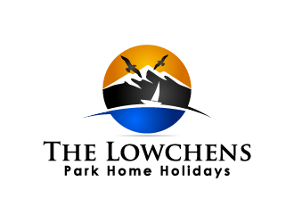
A holiday vacation logo needs to achieve one goal above all: create a sense of place. After all, the company is selling an experience of a physical place, enticing customers to come stay in their mobile home. See how our designer used elements of design to create a sense of place for The Lowchens Park Home Holiday.
Using Symbols From The Location
The Lowchens sits on a 200 acre lagoon with a view of a nature reserve, offering a vista of mountains, lakes, and forest. But designing a logo with every element of the natural view would result in a design that’s too cluttered and busy.
The designer instead focused on a minimalist scene design broke up into horizontal thirds. The top third used birds in the sky, giving a subtle nod to the forest by showing the wildlife that resides there. The middle third consists of the mountains. The bottom third is made up of the lake. This approach of assigning each scenic element their own section of the design, rather than mixing them up together, helps create order and balance.
Using White Space to Reflect the Space of the Park
Part of The Lowchens’ unique appeal is it’s spacious area. This is reflected in the design with the use of white space. The design as a whole utilizes space, with only one image and five words against the white backdrop. Among the text is white space, with enough kerning to keep the text from feeling cramped. The image itself also incorporates white space. The lake, the sky, and the mountains all function as white space for the birds and the sailboat. This spacious feel in the design showcases to the viewer the spacious nature of the park home.
Using Boundless Design to Symbolize Adventure
The scenic view of The Lowchens is found within a circle, but an element of the design extends beyond it. The horizon, an iconic symbol of adventure and the thrill of the unknown, goes beyond the confines of the circle’s lines. As the horizon “breaks free” of the circle, it sends a message to the viewer: adventure awaits! The sailboat in the design is on a journey traveling along the horizon, with its destination not within sight yet. This is a representation of what visitors to The Lowchens will experience. Gorgeous scenery and a bit of adventure to the opportunistic traveler.
Using Color and Alignment to Reflect Significance
The selling point of The Lowchens is its stunning view, and its importance needed to be reflected in the design. The only use of color in the design is in the image, which makes the view pop even more. The bold colors draw the viewer’s eye immediately to the image before glancing down at the company name. The placement of the image at the center of the image also reflects the significance of the view. The color and alignment are both used to give priority to the most important element of The Lowchens: the view.
These elements of design combine to create a sense of place in the logo, visually commenting on the experience a guest at The Lowchens can expect. Beyond its ability to comment on the business’ offerings, a good logo offers immense value for a small business from adding a professional appeal to branding the business. A business logo is not something to take lightly. It’s the first impression of your business! But a good logo should not break the bank. Hire our online designers to offer different choices for a fraction of the cost of hiring a graphic design firm, and receive options within an hour!


One reply on “Vacation Rental Logo Spotlight: The Lowchens Park Home Holiday Logo Design”
Pretty good for a 60 minutes logo design. 🙂