- $129
- BUDGET
- 135
- ENTRIES
BRIEF
DESIGNS (135)
- Logo Name:
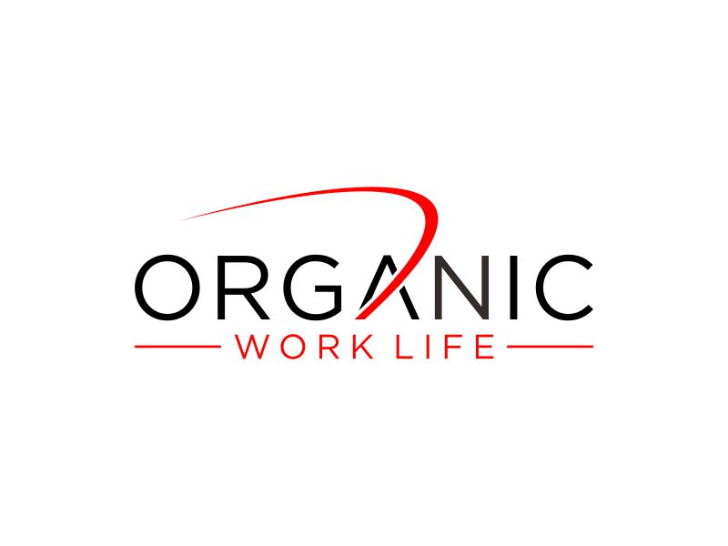
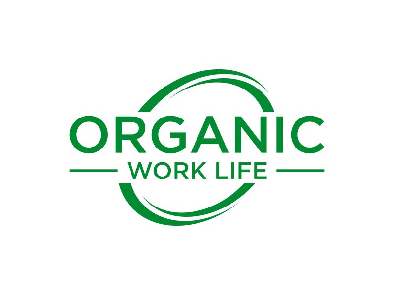
- Organic Work Life
- Company Intro:
- Organic Work Life will be a tribe of people who are fed up with their jobs and seeking purpose-filled work. Work they are naturally born to do. The audience will be adults over 40 who are burnt out and seeking a new opportunity to go within to discover purpose. I use ancient Indian spiritual practices to help them discover the souls purpose. I refer to hinduism, buddishism, and christianity. I Need something modern, clean and eye catching.
- Instructions:
- I was thinking about something that would be simple, but it could be something ancient indian. This course will be a spin off from my bhaloojay.com. Maybe an O with the words or OWL or the words spelled out. The brand is new, so I would want it eye-catching. Brand Colors - Mid Green, yellow, teal, Peach, Orange. If color is used, I would want no more than two color combos. Colors possibly matching those on bhaloojay.com.
Reference Samples:
- CThis will be a work course and will have nothing to do with farming and vegetables.
- CGood day designers, thanks so much for your wonderful work. I see a few designs that I like. Feel free to wrap the design with the logo and words in one. Almost like the logo for 48 hour logo. Be adventurous and maybe do it in a circle or square although I do like the layout of many of these. Think inner peace, yoga, finding peace at work, finding a job they love, getting out of the 9 to 5 grind and finding work they love. Peace at work. Thank you for all you do.
- CHey designers I am loving the blending of my current logo in with organic work life. This will be a course under Bhaloojay.com. I own the trademark so go for it.
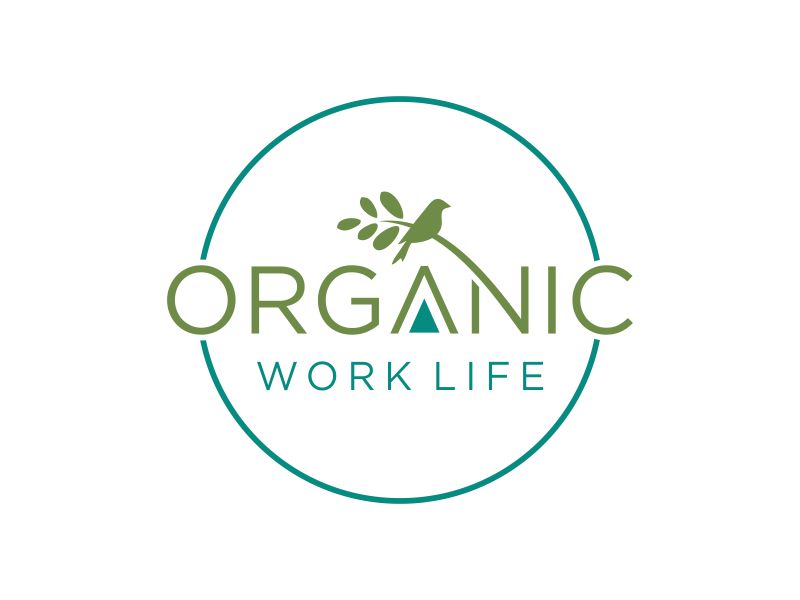
- CYou all are amazing!!! As I am winding down and leaning towards a decision I can tell you that I am leaning towards a simple yet eye catching design, something that would look good in black and white and color and the bird means a lot to me because it is part of my story. I believe I will want to include the bird in this logo. You all are awesome. I will check back in around 7:00 p.m EST. Thanks so much!
- CGood Evening designers, I am so happy with the designs that have been submitted. I didn't do a poll, but I did get some feedback from family members and friends. There are one or two designs that they said they would click on based on the information I gave them about the business. Below is the Feedback: Only 1 of the four people like the bird; I like the bird also. Circle designs seem to be favored It was suggested by three people to consider just using OWL in some creative fancy way None of the old fashion 1990 graphics are picks The design must look eye-catching in white and black and color No one favored the simple designs as #1, but they were liked. Everyone agrees that a single creative, eye-catching design would work. I hope this helps as we go into the last few hours. I will hide the designs that are not favored. I hope you can see that on your end. Thanks again, designers. I love that you all are so creative.
Open design concept stage had ended with 135 submissions from 25 designers. Go to DESIGNS tab to view all submissions.
