- $50
- EXPRESS
- 1
- ENTRIES
BRIEF
DESIGNS (1)
- Logo Name:
- Healthy World Cuisine
- Company Intro:
- I want you to create a logo for our new branding. We are currently Bam’s Kitchen http://bamskitchen.com. We are redesigning a new web site and the new url will be http://hwcmagazine (Healthy World Cuisine) Our website provides many healthy international recipes and recipes for those that have special dietary needs. We are moving away from a blog and now want to become a business. In the future, we will provide clients not only with healthy world cuisine recipes, but meal planning and health and diet training.
- Instructions:
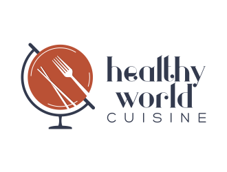
- 1) This logo Globe with plate and fork and chopsticks I created below needs to be cleaned up… a) uneven lines and rough edges need to be cleaned up b) the black globe stand and where is connects to the plate globe is too large and this needs to be minimized. maybe color changed as well... c) The white line in the globe needs to be hidden in some areas like the green globe on the left. d) The logo itself needs to be much smaller and also will need to have the tag line next to it or under it or around it (Healthy World Cuisine). My goal is to minimize the header area and reduce scrolling on the website. So clean and neat and concise. e) Please help me with color options. I thought at first I wanted green because it symbolizes healthy but I am unhappy with the black and green combination of colors. Maybe warmer colors such as yellows, orange red or even purples. (Food colors) I will attach some ideas below. f) I think I prefer regular colors verses muted colors. I really don’t like colored FONT but more of a dark gray or black so our color palate for the logo will need to complement this. g) The chopsticks and fork could be white like in the photo above or another color. 2) to the right or just underneath or around the globe with plate and chopsticks need to include the tagline “Healthy World Cuisine” . I do not want a cursive font as we have many international readers. However, I would like a clean and simple but memorable font. See this suggestion… love the lower case and 2 fonts. I like this font but I do not know what it is… http://simplerootswellness.com/ I will send some screen shots of this as well. Here are some website that I like for their font and clean logo design... http://fedandfit.com/ fun font and clean and neat logo- http://sheeats.ca/ - colors are warm and interesting font https://www.redandyellow.co.za/online/ (I do not like the font in this but their logo is small and some primary colors.) http://www.amuse-your-bouche.com/ - like the warm colors http://www.spoonforkbacon.com/ - like the clean logo design
Open design concept stage had ended with 1 submissions from 1 designers. Go to DESIGNS tab to view all submissions.


