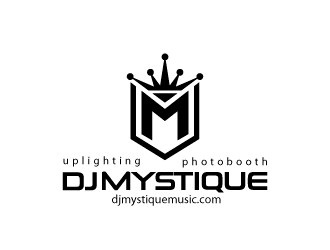
Designing a logo begins with a vision. What will the logo represent? What symbol or script will communicate that message? Visions usually appear in color, but logos do not have to be in order to be effective. The benefits of a black and white logo include a simple, concise, cost-effect approach to communication efforts.
Simple, Black and White Authority
Black and white exist as opposites, which makes their combination intelligent and balanced. The unification possibilities are seemingly endless, as the end result is a harmony of the absence and existence of space.
Nothing establishes professionalism like a simple black and white logo. The selective approach to designing a black and white logo delivers a forward-thinking arrival of a brand, announcing security and confidence.
Clarity & Cleanliness
The contrasting application of combining black and white creates a stark visual impact. The composition of these polar opposites dares the viewer to ignore its clarity and cleanliness. Clean lines, bare curves and attractive type will sum up an individual or company’s identity instantly, allowing the simple arrangement to stand out in a sea of color.
Quality Reproduction
The purpose of creating a logo is to apply it anywhere and everywhere the company principles are represented. One of the major benefits of a black and white logo is its reproduction prowess, including:
- Cost-effective printing costs
- Faster printing times
- Better for the environment
- Quality control
- Consistent output
Whether the black and white logo is being added to an email signature or printing directly onto an internal memo, standard home and office printers will deliver the exact reproduction each time.
This means color toner cartridges are unaffected, creating less waste and keeping internal costs to a minimum. When the logo is reproduced offsite for common applications including letterhead, envelopes, signage, banners or novelty items, the costs will be considerably lower than their 4-color counterparts.
What’s more is that black and white reproductions require very little quality control. The outcome is literally black and white which means there is zero room for interpretation in the final product’s visual character.
Finally, printing in black and white improves turnaround times internally and externally. Printing or copying black and white files is much quicker than the color alternative. Proofs can be approved effortlessly, and press checks become a thing of the past when black and white is the final product.
Designing a Black and White Logo
Simple, clean designs deliver quality control from the start. If you want plenty of design options to choose from, you can launch a logo contest and and have multiple designers compete for your job.


