Logo with a long name can be a challenge for designers because simply putting all text in one line will make the logo disproportional. So let’s look at some common practices when it comes to long name logo design.
- Can the long name be abbreviated?
For this you will definitely need to speak to your client. However in my experience, Don’t shorten the name by making it an abbreviation unless the customer does so already because teaching their customer a “new” name is expensive. - Using a condensed typeface
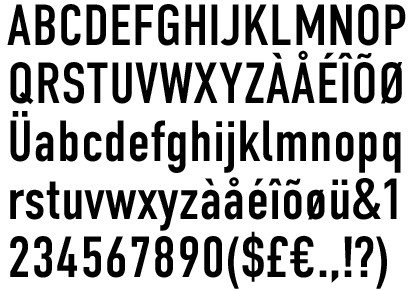
If you are to include lot of text in your logo, choose a font that take least amount of horizontal space.
- Find a suitable arrangement for the text
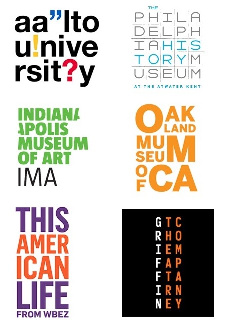
Be creative, you can arrange the text in more than one row and sometimes in very interesting fashions.
- Having two versions of the logo
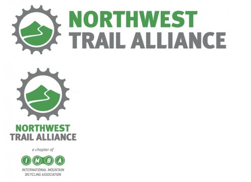
Personally I won’t recommend this approach because that makes the brand look inconsistent. But if your client agrees, this is also a viable solution.
- Get multiple ideas by holding a logo design contest
Launching a logo contest allow you to get dozens of design ideas from multiple designers. You are not going to like all the designs ,but someone just might find a clever design approach to make your long logo name looking attractive. - Try an online logo maker
A logo creator such as logogenie or LogoAi is able to auto-generate logo ideas by asking you a few questions about your brand. Some designs they generate is quite interesting so it doesn’t hurt to give them a try. They best part is they are free to try. You don’t have to pay if you don’t like their results.
